This project officially launched in late 2024, and I’m now able to share it publicly. Read the press release
One in eight Americans relies on SNAP EBT, also known as food stamps, to put food on the table—but no on-demand delivery apps supported it in 2024.
I led the design and UX of integrating SNAP EBT as a payment method in the Gopuff app.
Product / UX designer
Allow Gopuff customers to use their EBT benefits towards food items, supporting a federally funded payment method and increasing order volume.
1.
Understanding the problem
We want to create a way for users to easily pay with EBT in the app while meeting the requirements of the government program.
Here’s what makes EBT more complex than just adding a new payment method:
EBT can only be applied to certain food items.
Things like non-eligible items, tax, delivery fee, and tip need to be paid with another payment method. This means we have to support split payments.
The amount paid with EBT must be adjustable.
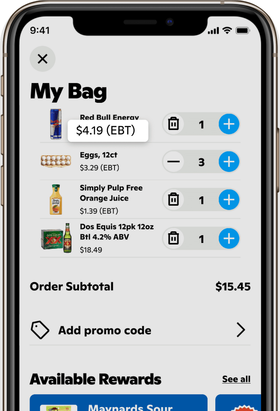
If a user has $15.45 eligible to be paid with EBT, they should be able to use $5.00 of EBT credit if they want.
Refunds have to be processed across two payment methods.
This makes issuing full and partial refunds more complex.
Gopuff takes on additional risk by adding EBT.
There will likely be an increase in payment processing errors now that we’re processing 2 instead of 1 payment method. Also, all of this work is contingent on Gopuff meeting online EBT retail eligibility requirements.
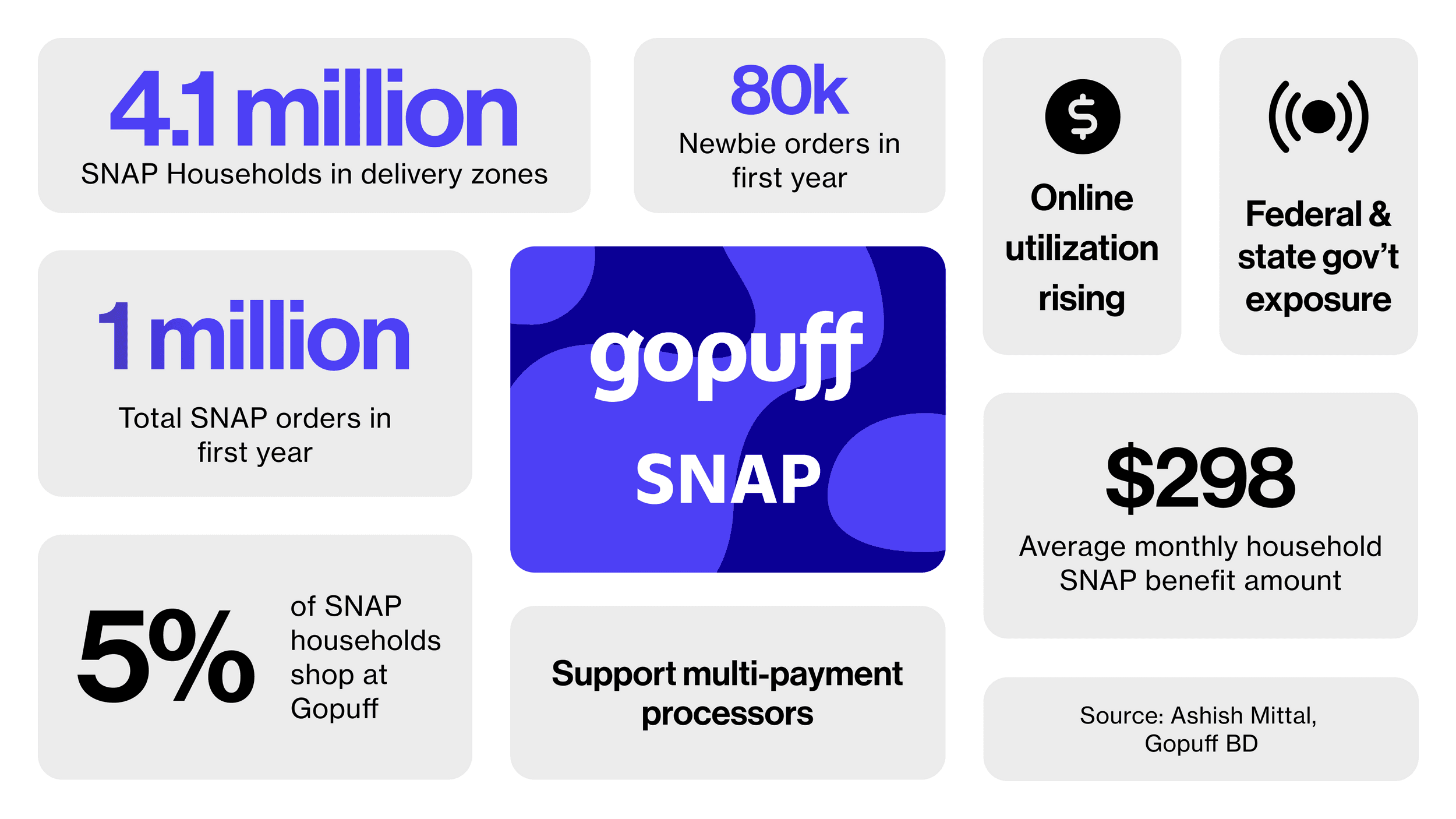
Potential impact
Even with all of these complications and risks, the potential impact of the project is large. According to the analytics team, we are estimating a first year revenue increase in the tens of millions of dollars attributed to EBT.
Competitive analysis
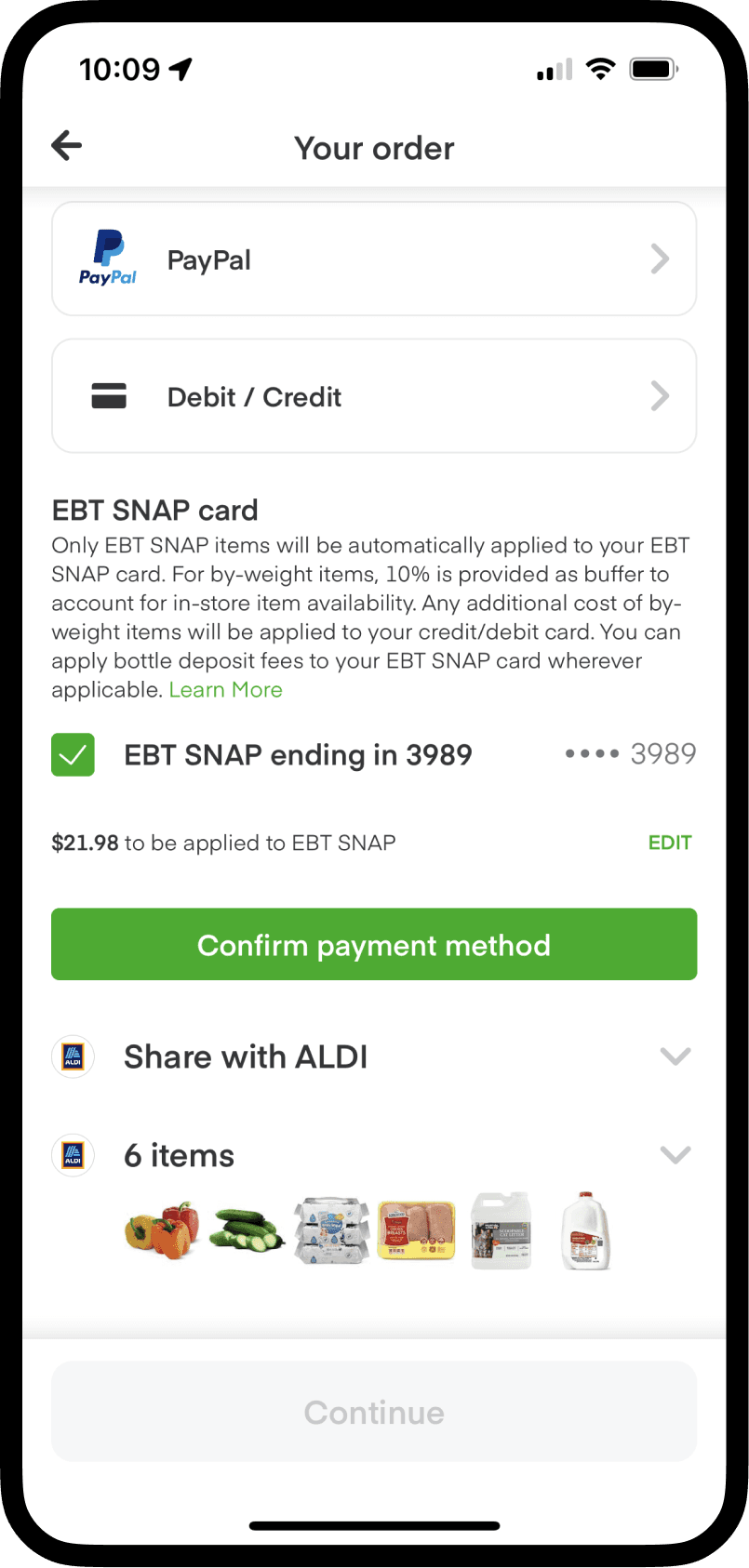
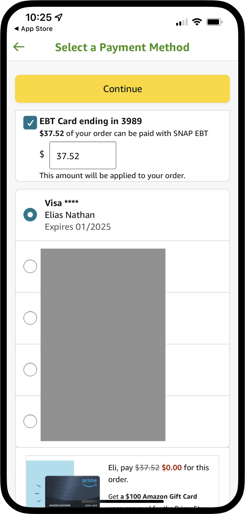
Even with a huge potential payoff, only 2 major online delivery services offer EBT payment on their apps – Instacart and Amazon Fresh.
Instacart uses a checkbox and confirm button on their checkout page. It takes up a lot of space and it looks like a bunch of separate components when it should look more cohesive.
Design goals
Before jumping into the design, I always like laying out specific design goals. Independent of all the numbers and analysis, what will a good user experience accomplish?
The goal: we want to use EBT to grow the number of people who use Gopuff to get everyday items and increase accessibility to our service.
In Pennsylvania, about 1/3 of EBT recipients are people with disabilities, and 1/5 are older adults. These groups would benefit from everyday needs and groceries delivered right to their door. I want to design the experience with these people in mind.
2. The design process
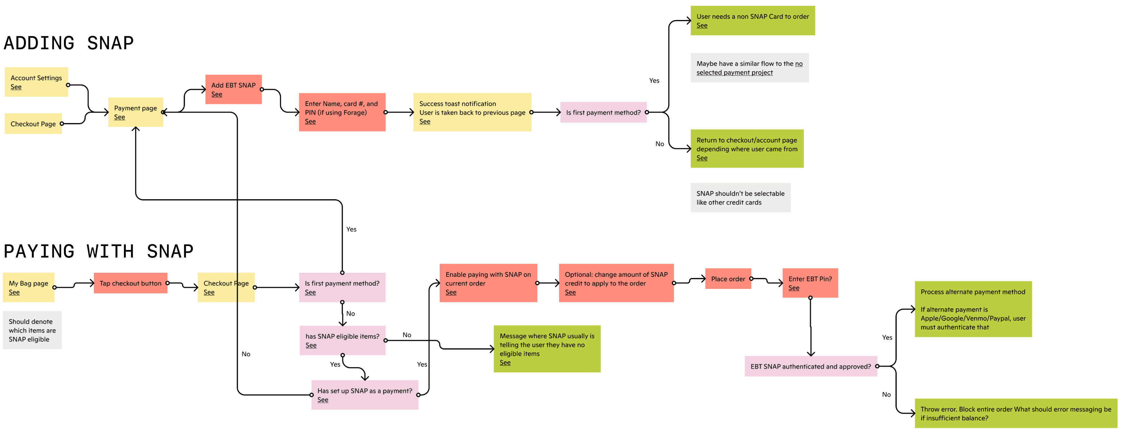
User journey map
There are two main flows I had to design
- Adding SNAP EBT as a payment method
- Paying with SNAP EBT
I started with the add flow, which is on the payments page.
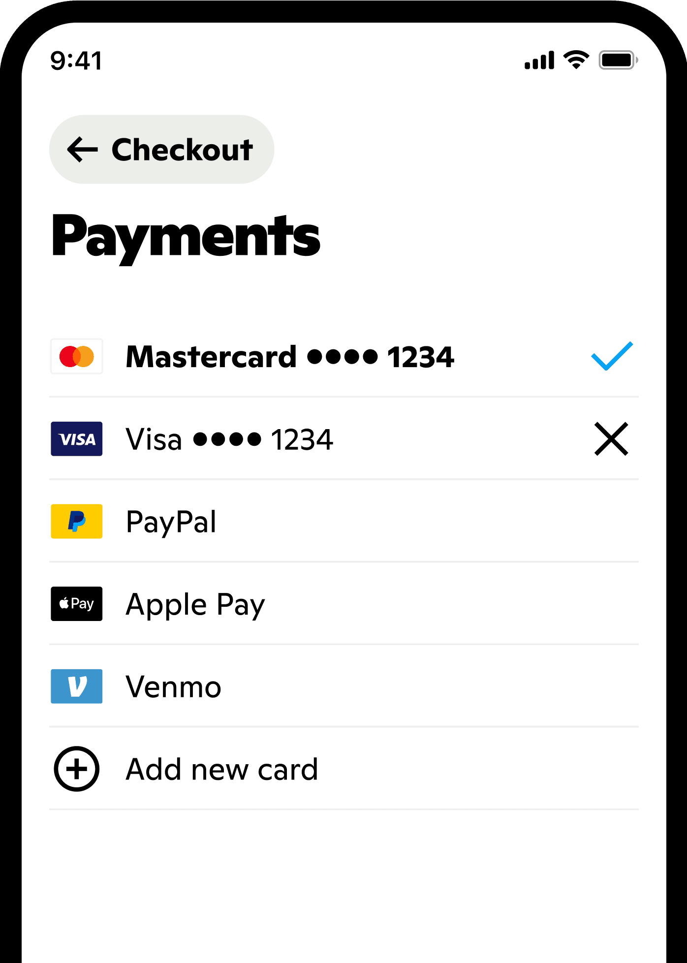
Existing payments page
The add flow is on the payments page. It’s a simple process that takes up a lot of space.
New payments page
From the beginning, my manager and mentor stressed that I should start by designing the best experience for the customer, even if that meant an obvious increase in engineering scope. I created a few out-there explorations for the payments page. Here are two of those.
These more out-there explorations allowed me to take a look at the most important parts of the payments page and let me pare down into the design I proposed to the PM.
This approach is similar to the existing page but splits payments into the ones saved and ones to be added. It also breaks EBT out into its own section, since it can’t be selected on its own.
Final design
When I brought this to the payments PM, she informed me splitting the page into two groups like I did was out of scope for this project. So I just slotted EBT into the existing payments page. In three days, it was live in production.
Paying with EBT
The heart of this project is how a user will pay with SNAP EBT. I started designing with three initial draft directions.
All of these designs had issues. The checkbox is a legacy HTML component and shouldn’t be used on mobile, and making EBT the primary payment method makes it so you can’t disable it unless you delete the entire payment method.
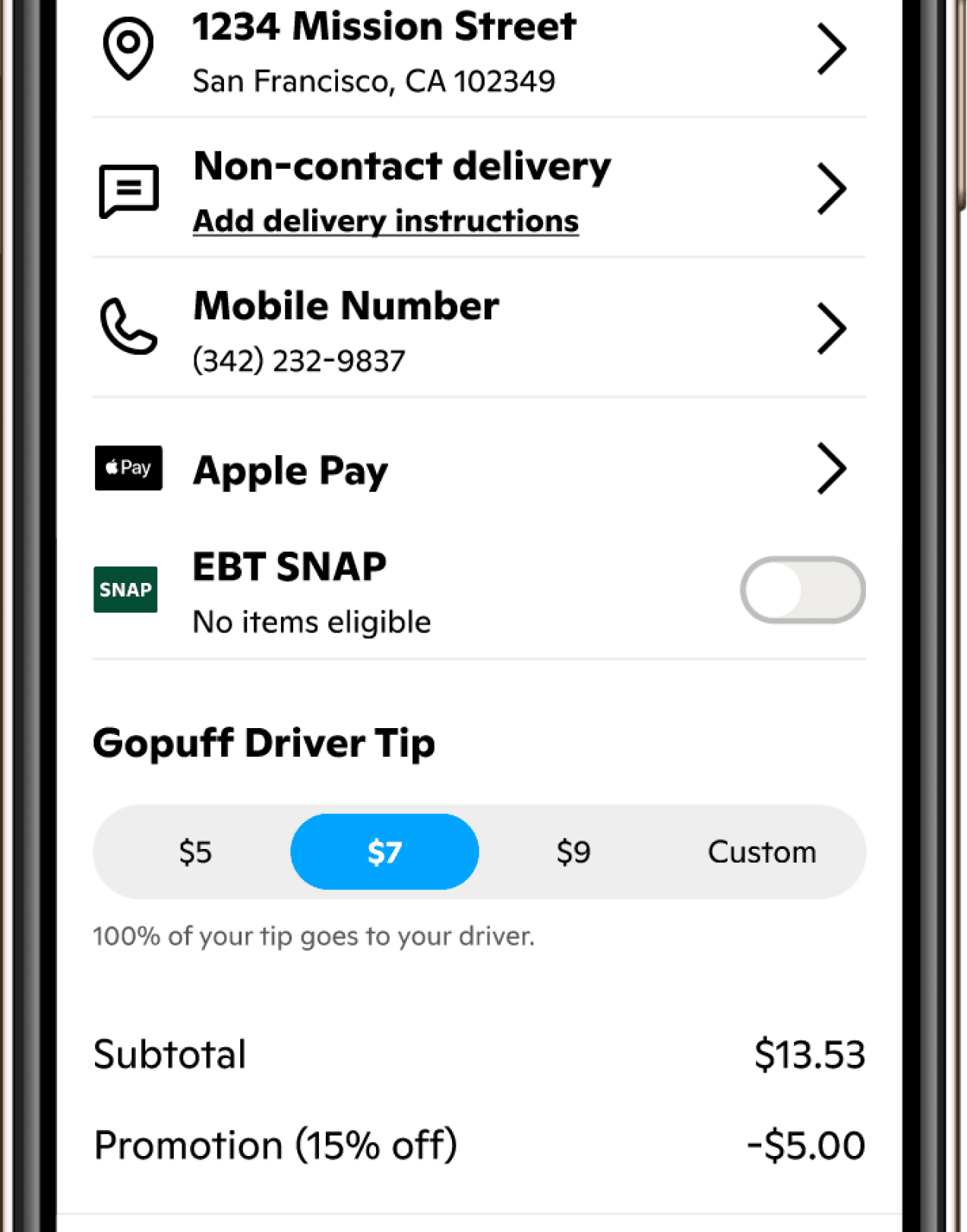
Final design
I decided to experiment with using a toggle component. I came up with an interaction that looks like it fits on the page using a single component.
More design decisions
Integrating EBT was a big project that touched lots of parts of the app. There were more design considerations I was trusted to think through.
Newbie flow
In order to reduce friction if the user has added their EBT card but no other card, they are allowed to tap the place order button but are instructed to add another way to pay.
EBT eligible?
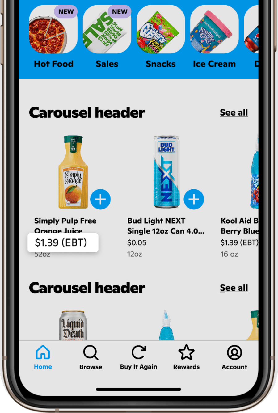
To denote whether a product is EBT eligible while browsing and in the cart, I decided to append a simple (EBT) after the price if the user has added an EBT card. This makes it noticeable but not too emphasized. A lot of users already know what’s eligible and what’s not.
No items eligible
If a user has added their EBT card but has no eligible items in their order, they still see the option, but it’s disabled.
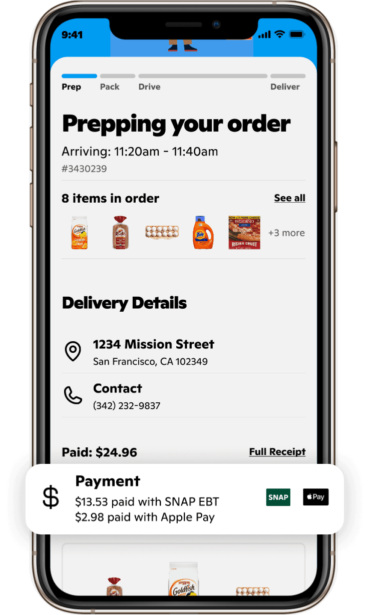
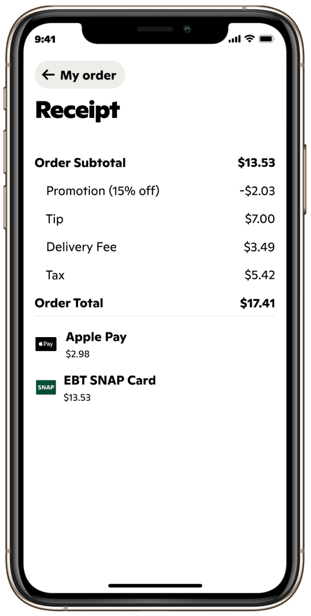
Order receipt
On the order receipt, we should show users their breakdown of payment. I tried to make it look as similar to the checkout screen as I could.
3.
Success metrics and reflections
This project launched in late 2024. We’re still tracking the success of the project, but initial results look promising. We’re looking for:
- Orders attributed to EBT
- Visit conversion attributed to EBT
- Revenue attributed to EBT
- Newbie growth attributed to EBT
If these numbers are in the ballpark of the estimates I laid out in the potential impact section, the project will be deemed an overall success.
Learnings
This was my first project during my internship at Gopuff. I learned a lot about the company and product / UX design as a whole.
Seek feedback early and often, and make it specific.
Early on, I would present my work to the PM or my manager and ask for general feedback. This got me unfocused and broad responses, so I got good at asking super specific questions about the details in interactions and components. This helped me get the feedback I needed to push the designs forward and improve them more quickly.
The right design often looks like a no brainer in the end.
Having finished the project, the final components and interactions that I created look like the obvious solution, but it took a bunch of iterations to get there. The design process that led me to the final result is where I learn the most about what makes a good designer. During iteration, unrelated explorations can sometimes make it to production, like the revamped payments page.
It’s the designer’s job to focus on the customer, create the best UX, and think without restraint.
Often, requirements change and projects get put on hold. It’s easy to get caught up in scope and prioritization, but when a designer takes on a bigger project like EBT, the design goals shouldn’t change from short term scoping or prioritization. We should always design the best experience for our customers, and then decide what has to go in the MVP.
Thank you
Thanks for taking the time to read this case study. I learned a ton from this project, and putting my process into writing also taught me a lot. If you want to connect, feel free to send me an email.
 “Saved” and “Add” payments
 Wallet style approach
 Final payments page proposal
 Checkbox approach
 EBT on payment page like Amazon
 EBT as primary payment